Initial development.
Physical integration
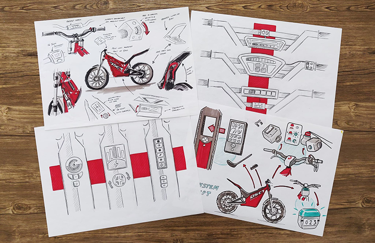
Initial ideas
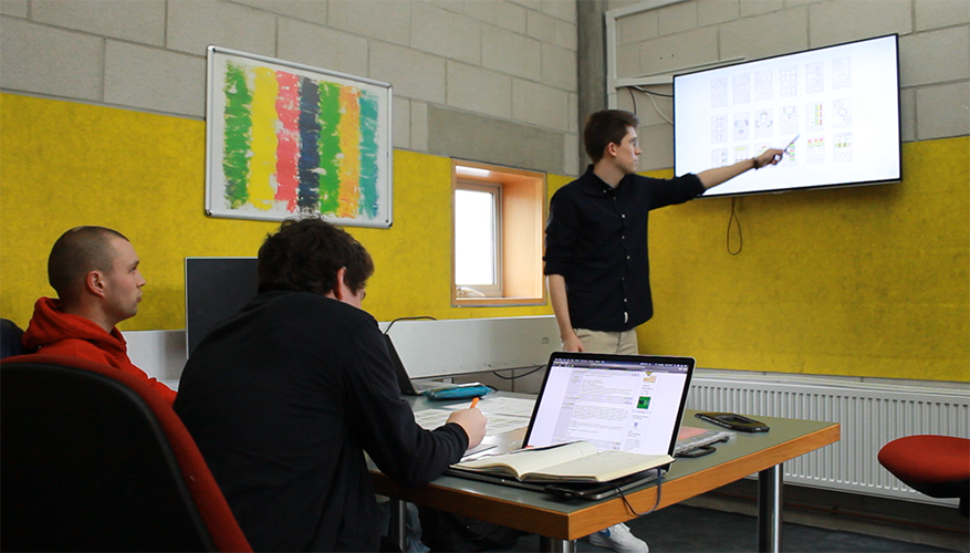
A wide range of product ideas for the scale, location and interaction of the design. These were presented to the team to ensure that I had interpreted the brief correctly. They were also useful to discover any product preferences that may have been missed out of the initial brief and identify avenues for future development to the companies liking.
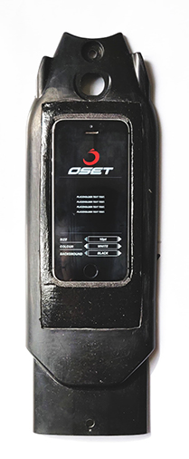
DRO location
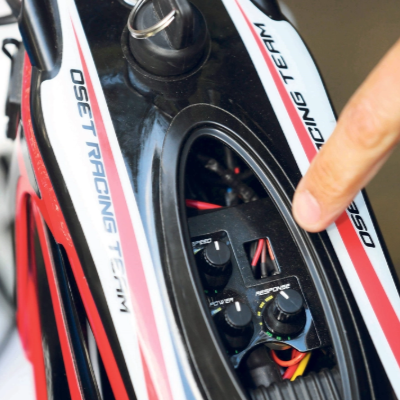
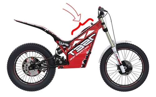
There were multiple ideas for how the control scheme might be integrated into the bike. However, due to the nature or the sport, the bikes receive a lot of physical impact force. Because of this the expensive controller was placed on the centre frame of the bike below the handle bars. This is the most protected part of the bike and is located closest to the power source, reducing the chance of pulled wires.
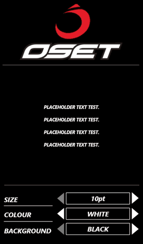
Font size testing
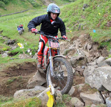
Trial bikes are used in all weather. As specified in the system requirements the DRO has to be usable in most environments, including poor lighting and wet weather.
To get an accurate representation of the screen used in this location, an Adobe XD file was exported to mobile phone. The casing of the bike's frame was modified so that the phone could be attached to the bike as a DRO be would when manufactured.
This set up allowed us to test the font sizes, font colours and background colours, in the expected environments and weathers and set parameters for the final design.
Interface design.
Information architecture
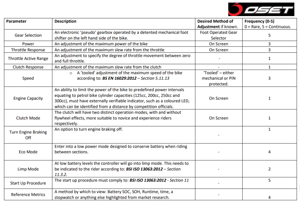
To begin, I conducted a frequency of use study on the various settings that could be changed on the bike. I also collected the standard method of adjustment for specific settings.
Mood board of OSET products and similar design styles
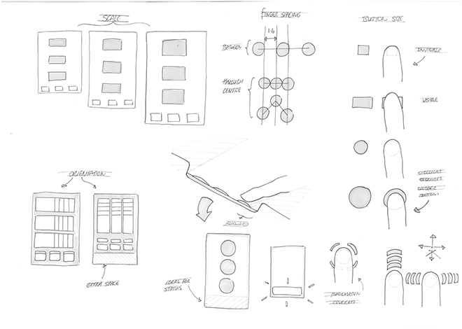
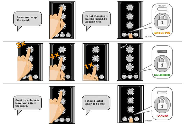
Using the results of the study I could decide upon a hierarchy of importance to begin building the information architecture. The site map was designed for use with a three button navigation system, (left - right - enter). With the number of settings required, and the limited control available, building this system was very complicated.
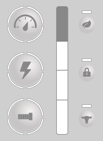
The site map gave priority access to the most commonly used settings and hid infrequently used settings behind extra menus to reduce clutter in the system. It also utilised pre-sets of commonly used setting combinations, such as an eco mode, and a full power mode. By tying additional requested features such as a timer and battery power tracker to the pre-sets in which they would most likely be used, I reduced the number of settings to cycle through.
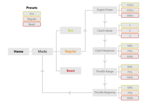
Pre-set management user flows
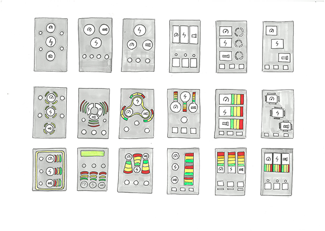
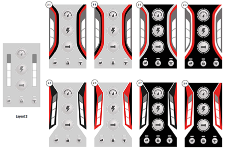
Wireframes
The frequency of use and user flow diagrams were used in conjunction with the font size test results to create a number of wireframe designs. These wireframes were tested in environment using the previously devised test rig, mounted to the bike.
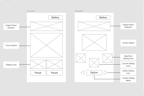
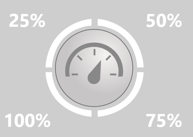
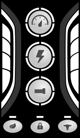
Wireframe designs
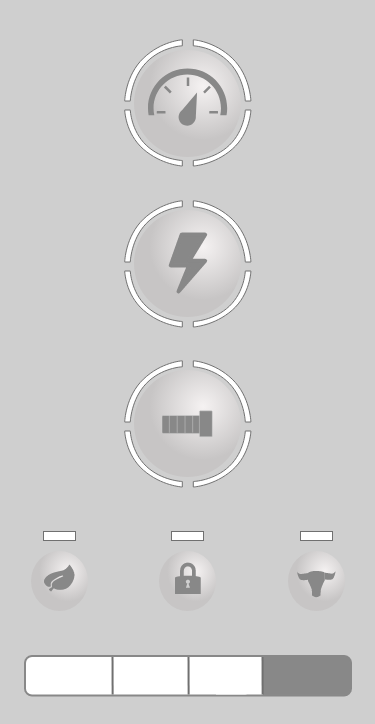
Hi-fidelity prototyping
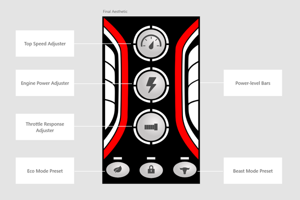
After deciding upon a final design I fully rendered the system in Adobe XD. This render included all of the option menus, interactions and transition animations to give the client a full understanding of the product.
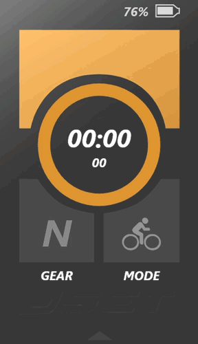
Fully interactive prototype